| Read the
Introduction to
learn more about target audience for this material and to obtain
subject background. This page introduces some of the fundamental aspects of monitor calibration and reviews the concept of color spaces. These are the corner-stones of Color Management. The articles accessible by means of the menu provide much more information. This page is just to re-inforce some of the fundamentals outlined in the Introduction. The Essence of Color Management and its Necessity: In the computer world, colors are represented by numbers. The actual colors you see when a device such as a monitor or printer converts those numbers into light are dependent upon technology limitations and even the subjective preferences of the equipment designers. The numbers representing an image have no meaning except what is given to them when a piece of software submits them to a physical devices such as a printer or monitor. Through the processes of device calibration and color management, referenced to international standards, we can minimize the adverse visual effects of differing color rendering technologies and philosophies. By this means predictable color rendition is obtained across the broadest possible range of presentation systems. The objective is to ensure, insofar as possible, that the original, intended appearance of an image file is minimally altered no matter by what means it is displayed. That's Color Management. Gray Scale: The gray scale (scroll down to find the test patterns) provides some visual indication of a monitor's ability to separate tones. It is linear with each patch separated from its neighbors by a numerical value of 10 (on the 8 bit scale of 0 to 255, beginning with the first dark patch at 5) in the original. It's a good tool for judging how well your monitor separates tones and, especially, how well it is liable to render detail in the darkest and lightest areas of an image. While viewing in subdued ambient light, you should be able to see at least a slight difference between the two brightest patches on the left and possibly between the two darkest patches on the right. No patches should share an apparent brightness. If these differences are not apparent, your monitor may have a restricted contrast range or it is incorrectly adjusted for any or all of Gamma, Brightness, Contrast. Don't worry too much about the darkest panels. This is an especially demanding test. If you can make out the third or 4th one from the right, performance is adequate if not exceptional. Bright panel separation is more important. The monitor calibration process, described elsewhere, will adjust your unit to make optimum use of its capabilities. Color Patches and Color Spaces: The appearance of the colored rectangles introduces some of the qualitative differences between color spaces. A color space is the formal specification of the total range (or gamut) of colors a presentation system can display and enables us to determine where that color space lies within the Profile Connection Space (described in the Introduction). All color patches here were originally generated as maximum valued shades. For example, the original red patch is [255,0,0]. The first set was converted to the sRGB color space which is what most monitors and the Internet assume. The second set was converted to the Adobe color space (aRGB) which is larger. The same source file was used in each case. The two sets were then displayed in a color managed workspace approximating Adobe RGB and a screen image was captured to provide the two sets as you see them here. In this way it is possible to convey some of the differences in appearance between the two color spaces in a default managed workspace (which is likely what you are using). The Adobe color space is larger than the sRGB Internet standard color space and can render a wider range of colors but its compatibility with the majority of monitors in use today is not nearly as good. You should see a distinct difference between the two Red patches (even on an sRGB monitor) between the two Greens and between the two Cyans. The sRGB Red will appear a bit dull, the Green a trifle washed out and the Cyan somewhat anemic. On an sRGB monitor (or a wide gamut monitor running in an sRGB color space), the differences will be less apparent than if viewing in a wide gamut color space such as aRGB. Similarly, the differences may be greater or less than intended if monitor Gamma is non-standard. You will come across color spaces and gamuts a lot when going through the articles in this section. The vast majority of computer systems and applications today ignore the color space specified for an image, unless you are viewing with an imaging package such as Photoshop which is said to be color aware. When displaying images (distributed over the Internet, for example) they simply assume sRGB. That means an image prepared to look its best in the larger aRGB color space will be incorrectly rendered in such a system and suffer a qualitative degradation. Increasingly, browsers are becoming color aware (Firefox, Safari) and wide gamut monitors less expensive. We can look forward to the day when images can benefit from being created in color spaces larger than sRGB with the expectation they will look as intended or, at least, that they will be correctly translated with minimal degradation into the smaller color space where it remains in use. Read the other articles in this section to learn more. |
This computer generated image is Copyright © 2009, GRKlatt
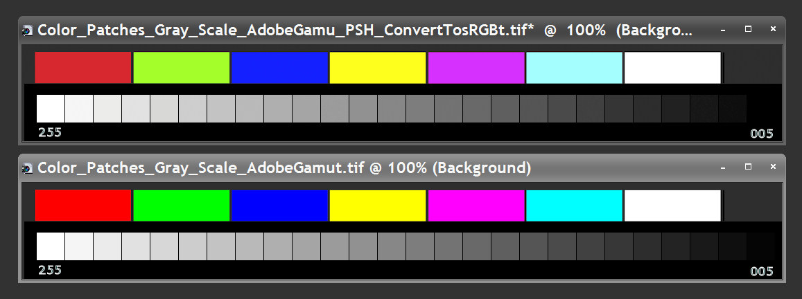
Note: Color and Gray Scale panels are separated by black borders to minimize distracting Mach Band effects.